Philadelphia publishes ‘meta’ dashboard for city’s open-data efforts
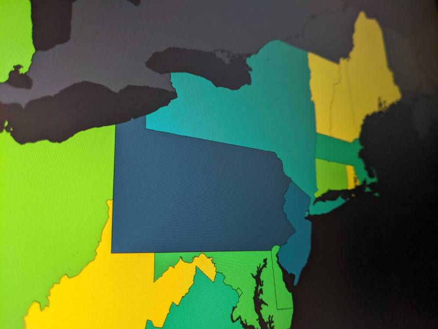
The City of Philadelphia on Tuesday announced the launch of a new dashboard to track the city’s progress with sharing its open data.
The new dashboard, designed by Open Data Program Manager Kistine Carolan and released by the city’s Office of Innovation and Technology, uses interactive maps to track where — and how many — people are using Philadelphia’s open data. It also contains measures of how often the city releases data sets, which departments share the most public data and how many data sets the city is automatically publishing and creating visualizations for. Carolan told StateScoop these measures are known to improve the accessibility and accuracy of open data.
She said the new dashboard was created largely because of the results of a citywide open data survey the city launched in early 2020 revealing that people wanted data that was more up-to-date and better illustrated through the use of visualizations. The survey also found they wanted easier ways to find data.
“The measures of success that we gleaned from the survey results were around making it easy for users to be able to see what we’ve recently published, to be able to see that the data that we’ve already published is more up-to-date, and that we’ve increased the number of visualizations that we share with the data sets that we publish,” Carolan said.
On the dashboard, users can see which data sets have been recently released, as well as which are queued up to be published in the near future. Users can sort by year to find old data, as well. Maps, graphs and charts make up the visualizations that, according to the survey, will boost user engagement, Carolan said.
“The impetus for open data itself is around government transparency, and I think likewise if the city has asked for feedback from residents and our open data users on what would make our program better for them, then it makes sense to be as transparent about our efforts meeting those needs going forward,” Carolan said.
The whole effort is a little “meta,” she said.
The survey showed that data visualizations helped residents understand data, so, Carolan said, “it felt like, well then, let’s make a visualization about our efforts to release data.”
